

Creative Studio
Sticker File Formats: PNG, PDF, SVG, or TIFF?
Choose PNG, PDF, SVG, or TIFF for custom sticker artwork. Learn file basics that help original characters, logos, and lifestyle designs stay crisp.
Quick answer
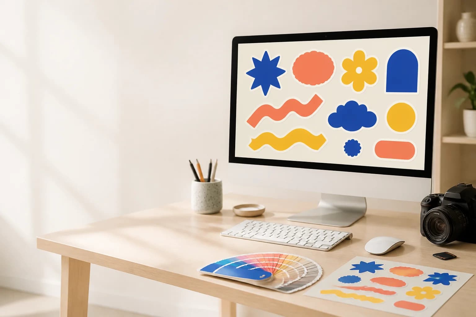
The best sticker file format depends on the kind of art you are making. SVG and PDF work beautifully for clean shapes, lettering, and simple icons, while transparent PNG is a great home for painted textures and expressive character art. Keep the original artwork handy so your custom sticker can stay clear at its final size. Start with the real place or feeling the sticker is meant to bring to life, then choose a scale that keeps the main idea clear. Character-led art works best when the silhouette reads before tiny details, while lifestyle stickers feel strongest when color and finish fit the objects people carry every day. For something truly personal, use the custom sticker studio to turn your own artwork, photo, or prompt into a design made for a favorite surface. Test the size there, keep room around the edge, and choose a finish that supports the mood instead of competing with it.
What makes sticker file formats feel personal?
The best sticker file format depends on the kind of art you are making. SVG and PDF work beautifully for clean shapes, lettering, and simple icons, while transparent PNG is a great home for painted textures and expressive character art. Keep the original artwork handy so your custom sticker can stay clear at its final size. Start with the real place or feeling the sticker is meant to bring to life, then choose a scale that keeps the main idea clear. Character-led art works best when the silhouette reads before tiny details, while lifestyle stickers feel strongest when color and finish fit the objects people carry every day. For something truly personal, use the custom sticker studio to turn your own artwork, photo, or prompt into a design made for a favorite surface. Test the size there, keep room around the edge, and choose a finish that supports the mood instead of competing with it.
Begin with identify whether the art is made from shapes, pixels, or both. For creators preparing artwork for custom stickers, that choice is more than a technical step: it decides how the sticker will feel when it becomes part of an artwork file becoming a sticker for a real-life surface. Look at the object from the distance people normally use it, then bring the design back to one clear focal point. A simple character, icon, or custom scene has room to connect when the scale, color, and border all support the same idea. Keep the important details strong enough to notice quickly, and let the quieter details make the design feel discovered over time. Step 1 is where the sticker begins to feel like a small piece of everyday storytelling.
Build the idea around a real everyday moment
Use these steps to move from a simple thought to a clear art file that keeps the original idea intact.
Begin with identify whether the art is made from shapes, pixels, or both. For creators preparing artwork for custom stickers, that choice is more than a technical step: it decides how the sticker will feel when it becomes part of an artwork file becoming a sticker for a real-life surface. Look at the object from the distance people normally use it, then bring the design back to one clear focal point. A simple character, icon, or custom scene has room to connect when the scale, color, and border all support the same idea. Keep the important details strong enough to notice quickly, and let the quieter details make the design feel discovered over time. Step 1 is where the sticker begins to feel like a small piece of everyday storytelling.
Keep an editable original alongside the export becomes more useful when you imagine it in a real setting instead of only on a screen. In a vector and high-resolution raster artwork design, the surface, lighting, shape, and surrounding objects all influence the final feeling. Try placing a paper outline on the item, or picture the sticker next to the things that travel with it. Does the main subject still lead the eye? Does the color feel at home there? This is also a lovely place to bring in painted texture, a hand-drawn face, or a bold mascot outline. A personal design does not need to be loud to be memorable; it just needs a clear reason to belong in the scene.
Treat use transparency when the art needs its own contour as a chance to make the custom sticker more recognizably yours. Choose the simplest version of the idea that still carries its emotion, then build outward only when each extra detail adds warmth, humor, or character. A small sticker has a limited stage, so a strong silhouette and a deliberate color pairing often say more than a busy collection of effects. If you are working from a photo or a prompt, pull out the feeling you want to keep rather than trying to copy every visual detail. That approach gives creators preparing artwork for custom stickers room to create a design that can grow into future characters, scenes, and sticker packs.
A helpful way to explore check the art at the intended physical size is to compare two friendly variations side by side. Keep the main subject and size steady, then change only one thing: perhaps the border, finish, palette, or pose. Notice which version makes the object feel more alive. The right option should make an artwork file becoming a sticker for a real-life surface feel intentional, not over-designed. This kind of small experiment is especially useful for an original character because tiny changes in expression, color, or stance can make a big difference. Save the version that feels most like your idea, and use it as a visual anchor when you add new stickers later.
Begin with keep edges clean around the main subject. For creators preparing artwork for custom stickers, that choice is more than a technical step: it decides how the sticker will feel when it becomes part of an artwork file becoming a sticker for a real-life surface. Look at the object from the distance people normally use it, then bring the design back to one clear focal point. A simple character, icon, or custom scene has room to connect when the scale, color, and border all support the same idea. Keep the important details strong enough to notice quickly, and let the quieter details make the design feel discovered over time. Step 5 is where the sticker begins to feel like a small piece of everyday storytelling.
Save a version that makes future custom sets easy to build becomes more useful when you imagine it in a real setting instead of only on a screen. In a vector and high-resolution raster artwork design, the surface, lighting, shape, and surrounding objects all influence the final feeling. Try placing a paper outline on the item, or picture the sticker next to the things that travel with it. Does the main subject still lead the eye? Does the color feel at home there? This is also a lovely place to bring in painted texture, a hand-drawn face, or a bold mascot outline. A personal design does not need to be loud to be memorable; it just needs a clear reason to belong in the scene.
- Identify whether the art is made from shapes, pixels, or both
- Keep an editable original alongside the export
- Use transparency when the art needs its own contour
- Check the art at the intended physical size
- Keep edges clean around the main subject
- Save a version that makes future custom sets easy to build
Choose the details that support the scene
The most useful choices are vector shapes or painted pixels, transparent art or a full background, one sticker or a reusable character asset, simple color fields or detailed texture. Let each one support the place where the sticker will live.
vector shapes or painted pixels becomes more useful when you imagine it in a real setting instead of only on a screen. In a vector and high-resolution raster artwork design, the surface, lighting, shape, and surrounding objects all influence the final feeling. Try placing a paper outline on the item, or picture the sticker next to the things that travel with it. Does the main subject still lead the eye? Does the color feel at home there? This is also a lovely place to bring in painted texture, a hand-drawn face, or a bold mascot outline. A personal design does not need to be loud to be memorable; it just needs a clear reason to belong in the scene.
Treat transparent art or a full background as a chance to make the custom sticker more recognizably yours. Choose the simplest version of the idea that still carries its emotion, then build outward only when each extra detail adds warmth, humor, or character. A small sticker has a limited stage, so a strong silhouette and a deliberate color pairing often say more than a busy collection of effects. If you are working from a photo or a prompt, pull out the feeling you want to keep rather than trying to copy every visual detail. That approach gives creators preparing artwork for custom stickers room to create a design that can grow into future characters, scenes, and sticker packs.
A helpful way to explore one sticker or a reusable character asset is to compare two friendly variations side by side. Keep the main subject and size steady, then change only one thing: perhaps the border, finish, palette, or pose. Notice which version makes the object feel more alive. The right option should make an artwork file becoming a sticker for a real-life surface feel intentional, not over-designed. This kind of small experiment is especially useful for an original character because tiny changes in expression, color, or stance can make a big difference. Save the version that feels most like your idea, and use it as a visual anchor when you add new stickers later.
Begin with simple color fields or detailed texture. For creators preparing artwork for custom stickers, that choice is more than a technical step: it decides how the sticker will feel when it becomes part of an artwork file becoming a sticker for a real-life surface. Look at the object from the distance people normally use it, then bring the design back to one clear focal point. A simple character, icon, or custom scene has room to connect when the scale, color, and border all support the same idea. Keep the important details strong enough to notice quickly, and let the quieter details make the design feel discovered over time. Step 4 is where the sticker begins to feel like a small piece of everyday storytelling.
- vector shapes or painted pixels
- transparent art or a full background
- one sticker or a reusable character asset
- simple color fields or detailed texture
Keep the design clear, warm, and easy to enjoy
The strongest sticker ideas give one subject room to shine and let every detail support that feeling.
A common miss is sending a tiny social preview instead of the art file. It usually happens when the artwork is treated as a flat image instead of a small object that will live in a real scene. Slow down and return to the main purpose: a clear art file that keeps the original idea intact. Let the surface, scale, and focal subject lead the choice, then remove anything that competes with them. If the design is character-led, make sure the expression still reads before adding decoration. If it is a lifestyle sticker, make sure it feels at home beside the things people already love. Small changes at this stage can turn a busy idea into a sticker people want to keep. This is the kind of detail worth testing in variation 1.
A common miss is flattening a character against the wrong background. It usually happens when the artwork is treated as a flat image instead of a small object that will live in a real scene. Slow down and return to the main purpose: a clear art file that keeps the original idea intact. Let the surface, scale, and focal subject lead the choice, then remove anything that competes with them. If the design is character-led, make sure the expression still reads before adding decoration. If it is a lifestyle sticker, make sure it feels at home beside the things people already love. Small changes at this stage can turn a busy idea into a sticker people want to keep. This is the kind of detail worth testing in variation 2.
A common miss is letting a soft edge blur the silhouette. It usually happens when the artwork is treated as a flat image instead of a small object that will live in a real scene. Slow down and return to the main purpose: a clear art file that keeps the original idea intact. Let the surface, scale, and focal subject lead the choice, then remove anything that competes with them. If the design is character-led, make sure the expression still reads before adding decoration. If it is a lifestyle sticker, make sure it feels at home beside the things people already love. Small changes at this stage can turn a busy idea into a sticker people want to keep. This is the kind of detail worth testing in variation 3.
A common miss is forgetting where the original editable artwork lives. It usually happens when the artwork is treated as a flat image instead of a small object that will live in a real scene. Slow down and return to the main purpose: a clear art file that keeps the original idea intact. Let the surface, scale, and focal subject lead the choice, then remove anything that competes with them. If the design is character-led, make sure the expression still reads before adding decoration. If it is a lifestyle sticker, make sure it feels at home beside the things people already love. Small changes at this stage can turn a busy idea into a sticker people want to keep. This is the kind of detail worth testing in variation 4.
- sending a tiny social preview instead of the art file
- flattening a character against the wrong background
- letting a soft edge blur the silhouette
- forgetting where the original editable artwork lives
Bring an original character or custom detail into the mix
A memorable sticker can be as simple as painted texture, a hand-drawn face, or a bold mascot outline. Give it a clear role in the scene and let it feel like your own.
Treat painted texture, a hand-drawn face, or a bold mascot outline as a chance to make the custom sticker more recognizably yours. Choose the simplest version of the idea that still carries its emotion, then build outward only when each extra detail adds warmth, humor, or character. A small sticker has a limited stage, so a strong silhouette and a deliberate color pairing often say more than a busy collection of effects. If you are working from a photo or a prompt, pull out the feeling you want to keep rather than trying to copy every visual detail. That approach gives creators preparing artwork for custom stickers room to create a design that can grow into future characters, scenes, and sticker packs.
A helpful way to explore an artwork file becoming a sticker for a real-life surface is to compare two friendly variations side by side. Keep the main subject and size steady, then change only one thing: perhaps the border, finish, palette, or pose. Notice which version makes the object feel more alive. The right option should make an artwork file becoming a sticker for a real-life surface feel intentional, not over-designed. This kind of small experiment is especially useful for an original character because tiny changes in expression, color, or stance can make a big difference. Save the version that feels most like your idea, and use it as a visual anchor when you add new stickers later.
A quick custom sticker checklist
Before you make the final version, confirm the surface, size, main subject, vector and high-resolution raster artwork, and the mood you want people to feel.
a simple real-surface test becomes more useful when you imagine it in a real setting instead of only on a screen. In a vector and high-resolution raster artwork design, the surface, lighting, shape, and surrounding objects all influence the final feeling. Try placing a paper outline on the item, or picture the sticker next to the things that travel with it. Does the main subject still lead the eye? Does the color feel at home there? This is also a lovely place to bring in painted texture, a hand-drawn face, or a bold mascot outline. A personal design does not need to be loud to be memorable; it just needs a clear reason to belong in the scene.
Begin with a saved copy of the artwork and layout. For creators preparing artwork for custom stickers, that choice is more than a technical step: it decides how the sticker will feel when it becomes part of an artwork file becoming a sticker for a real-life surface. Look at the object from the distance people normally use it, then bring the design back to one clear focal point. A simple character, icon, or custom scene has room to connect when the scale, color, and border all support the same idea. Keep the important details strong enough to notice quickly, and let the quieter details make the design feel discovered over time. Step 2 is where the sticker begins to feel like a small piece of everyday storytelling.
- The everyday surface is chosen
- The main subject reads clearly
- The size suits the available space
- The finish supports the mood
- The character or custom detail feels original
- The design is ready to become part of a sticker story
Ready to make it yours?
Choose a favorite object, a clear main subject, and a mood that feels like you. Then bring your artwork, photo, or prompt to our custom sticker studio to shape a one-of-a-kind sticker for everyday life.
StickerMigo journal
Made for everyday stories
Updated with fresh ideas for custom, lifestyle, and character stickers.